
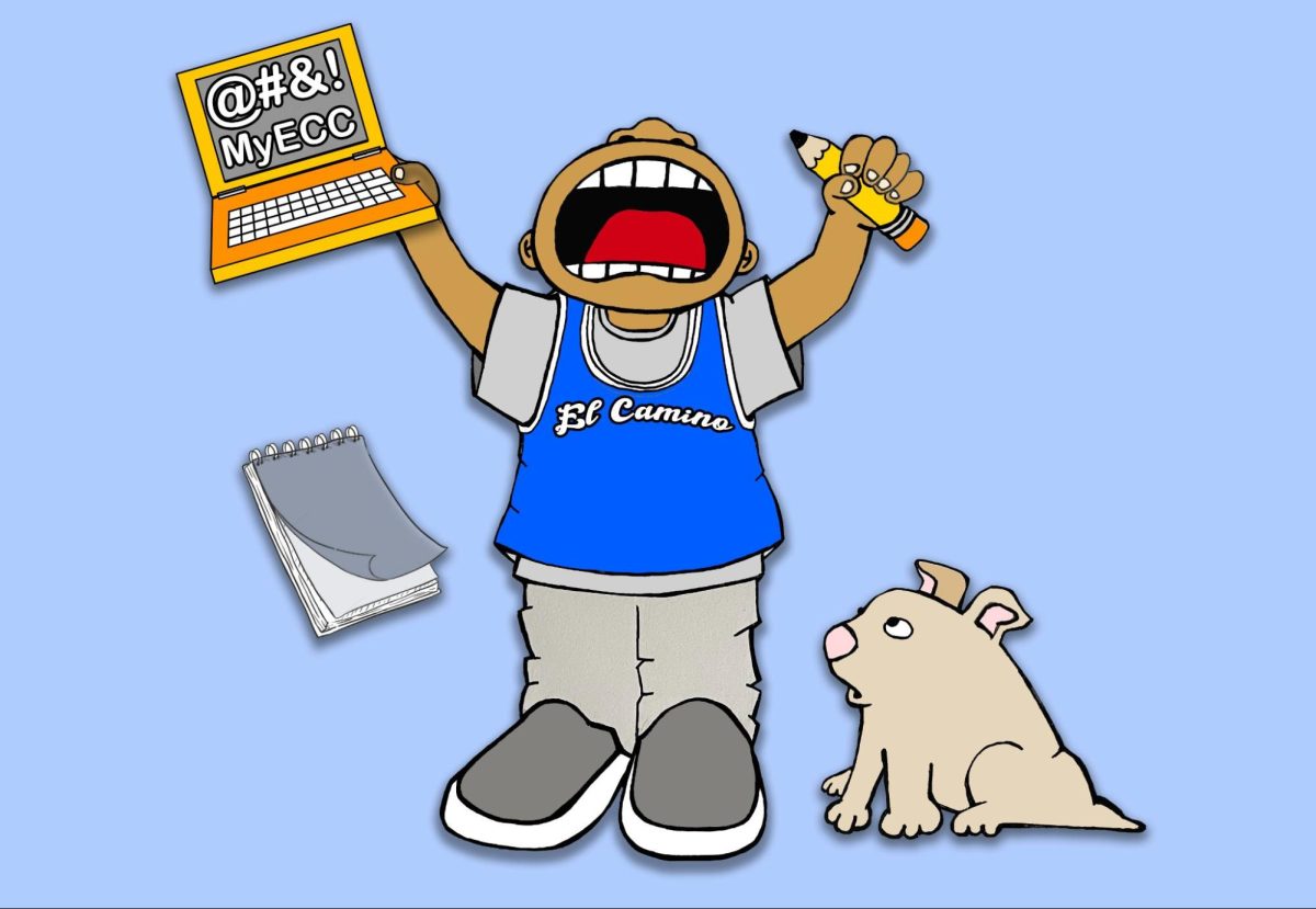
El Camino College’s website falls short in navigating to important student login pages. It requires unnecessary clicks to get there.
Despite recent redesigns made to the site there are still some improvements to be made.
Many students visit the website to login to MyECC and Canvas to view information such as financial aid, class details and school emails.
When navigating through other community college websites, many have a quicker way to access these login pages.
Landing on the homepage of the El Camino College website brings up an image slideshow of certain topics and events focused around the campus.
As you scroll down, there are blue-text boxes filled with more information not many will read along with more images.
Other college websites are noticeably more inviting with the colors, graphics and images used.
To get to the MyECC and Canvas logins on El Camino’s website, you have to click on the respective menu bar item which takes you to a description page.
Then you have to click another button to get to the actual login page. One click should do the job. When it comes to clicks on a website, less is better.
Over and over these two clicks mount up over time for any student who needs to constantly access these pages.
For some students, Instead of clicking through multiple links on the website, it’s easier just to directly search the information you need, or just bypass the website altogether and just use Google.
Santa Monica College and Glendale Community College have their student portal login at the top of their site similar to El Camino’s.
But theirs open a new tab straight to the login page. One click straight to what a student needs.
Other colleges such as Orange Coast College and Cypress College also have a one-click system to get to the login pages.
Many use vibrant graphics with images and videos that make a webpage stand out.
Riverside City College plays a slideshow of videos on its main page displaying various activities and people on campus interacting with each other, seeming to have a good time.
The El Camino website should incorporate videos to capture the attention of new students coming from a generation with decreased attention spans.
In an article by Keystone Education Group, Thais Roberto writes how research done by Microsoft in 2015 found the attention span of Gen Z individuals to be about eight seconds.
With the evolution of social media and the increase in popularity of the short-form video format, El Camino should continue to update their website design.
Mobile navigation should be prioritized as well since many students use their phones more than any other device.
Optimizing the mobile experience by incorporating videos could keep the attention span of younger people who have become accustomed to viewing content in this style.
To keep students attracted to El Camino’s website, there should be continued redesigns and implementations of ideas from other colleges and social media platforms.
Update it so it doesn’t feel stagnant with images and navigation menus that lead to text page after text page filled with information no one will read.
Have the important login pages be quickly accessible and provide easy navigation to relevant information.
Those in charge should keep in mind what students currently use the site for and how future students may view the site in comparison to other colleges.
A website is the official online presence of any organization. The site represents the college and, for many interested in applying, it is their first El Camino “experience.”
It should make a good first impression.