

When I first enrolled at El Camino College in 2016, I attended the freshman orientation in the Marsee Auditorium. There, a panel of students were essentially begging to learn how to use the MyECC console.
They were talking about how confusing the system could be and that using it as much as possible was the only way to use it effectively.
Because of that panel, my first perception of MyECC was that it was a daunting program that would take forever to master.
But in reality, it’s not the hardest web portal in the world. The panel at the auditorium was making me expect the worst and instead I got something that was pretty decent.
I’ve been around ECC for a few years now and spent more than a fair amount of time in the doldrums of MyECC and there’s a few things about it that I want to see cleaned up.
I don’t want MyECC migrated over to new servers or designing an entirely brand new user interface. That first suggestion is completely unnecessary and unless that second option was outsourced to a private team to handle, it would just take too long to do properly.
Plus, there’d be an incoming wave of students who’s first experience with ECC’s online landscape would be a confusing, under-construction mess.
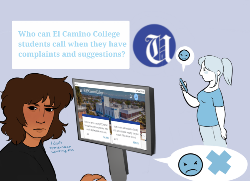
MyECC, from a design perspective, looks like it’s out of the early 2000s. And that’s not totally a bad thing, because for the most part MyECC’s dashboard is effective with what it’s trying to do.
There’s a really fine line to walk, design-wise, when something has as many features as MyECC does.
The goal is to create a layout that does multiple things all at once: give students all the options available to them, makes those options not flood the page in an intimidating way and have the interface be straight-forward enough that all walks of life can navigate it.
But the biggest change I want to see to MyECC is the removal of the dead links scattered throughout the portal.
The “Newsfeed” link at the top of MyECC redirects to a dead page. The “OneDrive” link doesn’t work and neither does “Sites.”
All of these buttons are at the very top right of the portal. I can’t remember a time when any of these worked.
Even if these options are in the midst of being implemented or properly fixed, they should only be publicly visible if they work.
In the meantime, less links floating around MyECC allows the web portal to look more professional and students don’t have to spend as much time in the portal wafting through them.
There’s a “hamburger menu” (a button with three horizontal lines) that’s right below the MyECC logo that extends out and gives users four options: search via a search bar, “Return Home,” “Help,” and “Student Home.” “Return Home” and “Student Home” are completely redundant.
And right below the hamburger menu is a path navigator that shows the icon of a house, followed by an arrow leading to Student Home.
The hamburger menu and path navigator have four links combined that all do the same thing.
There’s also the “Team Sites” column located in the far left row of MyECC. It’s the column at the very bottom.
In my experience going back to 2016, back before Canvas was fully integrated into the online El Camino College landscape, team sites were used a lot.
But since Canvas was fully integrated with ECC’s online presence, I haven’t had a single class use a team site.
My “Team Sites” portal has been returning an error for a few semesters now.
In an effort to make the portal easier to navigate, the “Team Sites” column should be removed, or at least make it able for us to hide it.
Those are things that should be removed from MyECC, but there’s one thing that should be added. The hamburger menu should have a few important options in order to make it a relevant part of MyECC.
I asked some students what pages they use on MyECC the most and the general consensus was that students use the website to access Canvas, register and pay for classes, check grades, get unofficial transcripts and use Starfish.
Right now, if students don’t have Canvas bookmarked, they have to navigate to the El Camino College website itself and click a link that opens Canvas in a new window.
Registering and paying for classes is available in one of the columns of MyECC, as are grades and unofficial transcripts.
Someone told me Starfish is there somewhere, but I’ve never found it and honestly never knew it existed for the college until this semester.
We should be able to get to these options with as little button clicks as possible and if the MyECC web portal really is in the best interest of us, then these options should be in a menu of some sort at the top of the page.
It makes sense to reuse the redundant hamburger menu for this purpose.
It feels like we’re in a weird limbo with ECC’s online presence. MyECC still looks like it did at least three years ago (links to dead sites and all), yet the modern Canvas learning management system is almost completely integrated into our online college experience.
Right now, the portal feels neglected. A little housekeeping will go a long way.
Removing those dead links would make the interface less intimidating for students to navigate and would look more professional. Adding just a few quick links to the top of the page would increase our efficiency.
With a revamped MyECC, panels won’t have to beg freshman to get used to the web portal, because instead it’ll be something that’s easy for anyone to jump into and use.